LOOKING GOOD, SOUNDING GREAT: The Power of Visuals in Podcasting


Getting Started
In a world where attention is scarce, visuals play a crucial role in capturing interest. On platforms like YouTube, creators have long understood the power of compelling thumbnails—strong visuals that entice viewers to click. Social media platforms thrive on images that stop users mid-scroll. The same principles apply to podcasts.
For years, podcasters have relied on a single cover image to represent their show, assuming that audio alone was enough to engage audiences. But as podcasting has grown into a more competitive and visual medium, adopting episodic artwork can help differentiate your show, improve discovery, and deepen engagement.
When listeners browse podcast platforms, they make split-second decisions based on what stands out. Just as a well-designed book cover can draw someone in at a bookstore, strong episodic artwork can be the difference between a potential listener stopping to explore your episode—or scrolling past it.
Similarly to browsing a grid on Instagram, we’re naturally drawn to fresh and enticing visuals. Having episodic artwork for each episode not only aids in discovery but also takes audiences deeper into the world of your story. Dive into the benefits and how-to’s for enhancing your show with episodic artwork below.
What Is Episodic Artwork?
Episode artwork refers to unique visuals created for each individual podcast episode, rather than using a single, static image for the entire show. This can include:
Specialized graphics reflecting the episode’s theme or guest.
Seasonal or thematic variations with current events or holidays relevant to the episode..
Illustrations or photography that visually capture the essence of the episode.
The Role of Episodic Artwork in Growing Your Podcast
When you invest in visuals for each episode, you give your audience more ways to engage with your content. Whether they see your show on podcast platforms like Apple Podcasts, Spotify, or in a social media post, a great image can drive curiosity, clicks, and ultimately, more listens. Episodic artwork isn’t just about aesthetics—it’s about strategy. A well-crafted episode image:
Makes your podcast more discoverable across platforms.
Helps tell the story of each episode before a listener even presses play.
Reinforces your podcast’s brand, keeping it visually top-of-mind.
Creates opportunities for better social media promotion and sharing.
Best Practices for Episodic Artwork
Keep Your Brand Consistent
Your episodic artwork should complement your podcast’s main branding while allowing room for creativity. This doesn’t mean every episode needs a completely new design—consistency helps build recognition. Consider:
Using a signature color palette or typography.
Incorporating a repeating design element, like a logo or framing device.
Establishing a visual theme that fits your podcast’s tone (e.g., minimalist and modern, bold and expressive).
Prioritize High-Quality Images
Blurry, low-resolution images won’t make an impact. Stick to high-quality, sharp visuals that look great across all platforms and screen sizes.
Recommended size: 3000 × 3000 pixels (ensures clarity even when resized).
Format: JPEG or PNG (widely supported across podcast apps).
Keep the file size under 1 MB for quick loading.
Make Text Legible
If you include episode titles or guest names, ensure they’re easy to read, even at small sizes.
Avoid overly decorative fonts that sacrifice clarity.
Use contrast—light text on a dark background (or vice versa) improves readability.
Place key information in the center or upper half of the image to avoid cropping on different devices.
Adapt for Social Media
Your episodic artwork isn’t just for podcast platforms—it can also be a tool for promotion. Consider designing artwork that:
Works well as a square for podcast apps.
Can be easily resized or adapted for Instagram Stories, X (Twitter), LinkedIn, and Facebook.
Leaves space for additional text overlays (e.g., episode highlights).
Making Episodic Artwork a Seamless Part of Your Process
At first, the idea of creating unique artwork for every episode might seem time-consuming. But it doesn’t have to be. Here’s how to make the process efficient and scalable:
Choose a Repeatable Design Approach: Not every episode needs fully custom artwork. Many successful podcasts use simple, effective strategies.
A guest-based approach: Use a high-quality photo of your guest with a consistent background or color overlay.
A template-driven approach: Create a single design with interchangeable elements like episode numbers or themes.
A highlight approach: Feature a striking visual or keyword from the episode’s topic.
Use Tools That Make Design Easy
You don’t need to be a designer to create great artwork. Tools like Canva, Adobe Express, or Figma allow you to create high-quality visuals with minimal effort. Setting up a few reusable templates can dramatically cut down the time spent on each new design.
Make It Part of Your Publishing Workflow
If you’re already uploading new episodes, adding artwork should be just another step in the process. At QCODE, we use Megaphone, which makes it easy to attach episodic artwork that appears on Apple Podcasts, Spotify, Pocket Casts, and any podcast app that supports it.
Publishing
Getting started is super simple. Once you’ve determined your art style and approach all you need to do is publish it in your feed. At QCODE we use Megaphone which means you’ll have the option to add your artwork there so it appears on Apple Podcasts, Spotify, Pocketcast and all podcast apps that support it. Follow these steps:
Prepare Your Artwork
Dimensions: 3000 × 3000 pixels (recommended)
File Format: JPEG or PNG
File Size: Under 1 MB
Resolution: 72 DPI
Color Space: RGB
Keep design elements (text, logos) clear and centered to avoid cropping on various devices.
Access Your Dashboard
Log in to your Megaphone account and navigate to your show’s dashboard.
Upload for Each Episode
Select the specific episode from your episode list.
Look for the “Artwork” or “Episode Image” field/option.
Upload your prepared image file.
Save your changes to ensure the episodic artwork is applied.
Review on Podcast Platforms
After uploading, wait a short time for your new artwork to appear on Apple Podcasts, Spotify, and other podcast apps.
And just like that, you have episodic artwork live!
Wrapping Up: Small Change, Big Impact
Episodic artwork is an investment in your podcast’s success. It isn’t just about making your podcast look better—it’s about making it more discoverable, engaging, and successful. In an era where podcasts are competing for attention across multiple platforms, visuals can give you an edge.
By incorporating episodic artwork, you’re not just adding another step to your workflow—you’re making a strategic choice to invest in your podcast’s long-term growth.
It’s a simple change with a powerful impact. And with the right approach, it can become an effortless part of your podcasting routine.
Appendix: Episode Artwork We Love
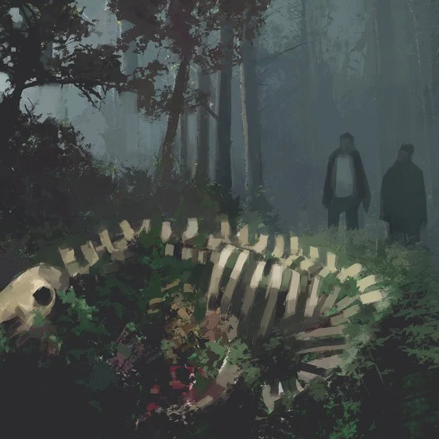
In The Dark — The New Yorker
The episodic art for “In the Dark” powerfully illustrates how visuals can capture each episode’s essence and hook new listeners. Every image—from the lone figure in the glowing doorway, to the exploding vehicle, to the helicopter hovering over a cityscape—instantly conveys drama, tension, and intrigue. In just a glance, potential listeners understand that these episodes explore high-stakes stories. This episodic approach uses consistent typography and a moody, shadowy color palette to unify the artwork, so viewers always know they’re looking at “In the Dark,” even as each image stands out with its own visual story.
Ultimately, this style of artwork does two crucial things: it stops people mid-scroll—because the imagery is so striking—and it offers a quick preview of the episode’s content. That combination not only sparks curiosity but also creates a strong first impression of professionalism, immersing audiences from the moment they see the artwork.


Borrasca — QCODE
While biased, the artwork for “Borrasca” undeniably sets a foreboding mood that perfectly matches the show’s spine-tingling narrative. Each episode’s image often features eerie silhouettes, ominous color gradients, or unsettling symbols that hint at the small-town secrets waiting to be unraveled. This visual style captures the listener’s attention by suggesting a chilling mystery just under the surface, compelling them to hit “play” and delve deeper into the story’s dark twists and turns. Even with shifting imagery, the recurring elements—like subdued lighting and a limited but dramatic color palette—instantly signal that it’s “Borrasca.”
Beyond creating an immediate sense of intrigue, they help the podcast stand out in a crowded feed, signaling to newcomers that Borrasca isn’t just another thriller—it’s an immersive audio drama backed by striking visuals. By visually communicating the tension and suspense at the heart of each installment, the artwork amplifies anticipation, primes the audience for a haunting narrative, and keeps loyal listeners coming back week after week.


Wiser Than Me with Julia Louis-Dreyfus — Lemonada
“Wiser Than Me” nails the idea of an always-on show that doesn’t require fully commissioned artwork week after week. By relying on a consistent format—simple color-blocking, playful line work, and a single stand-out photo—the show’s visuals remain recognizable while still leaving room for subtle changes. It’s proof that a templated design can be both efficient and effective, showcasing the show’s personality without sacrificing variety.
These recognizable visuals help dedicated fans instantly spot fresh episodes while also drawing in new listeners intrigued by the familiar yet ever-evolving imagery. It’s proof that consistent, straightforward artwork can be just as memorable and compelling as fully custom designs, particularly for a podcast that stays active in the listener’s feed week after week.


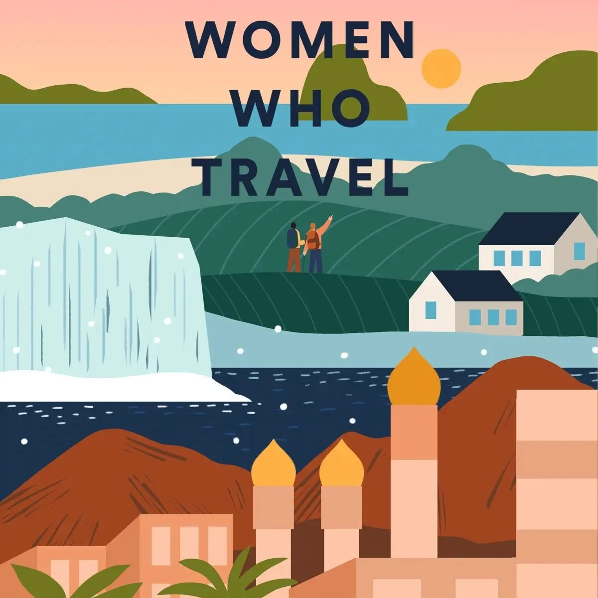
Women Who Travel — Condé Nast Traveler
For “Women Who Travel,” the episode artwork radiates a sense of adventure, empowerment, and cultural curiosity, mirroring the podcast’s focus on global exploration. Whether it’s a snapshot of vibrant city streets, a serene mountainscape, or an evocative portrait of a female traveler immersed in a new environment, each image sparks wanderlust. The bright, bold color choices and lively typography signal the show’s uplifting energy and diverse perspectives, enticing potential listeners to discover the stories behind each journey.
This approach does more than just catch the eye—it also reinforces the podcast’s commitment to inclusivity and inspiration. By making each episode visually distinctive yet unified by a recognizable design style, “Women Who Travel” quickly becomes identifiable across various platforms. The result is a strong brand presence that appeals to seasoned travelers and curious first-timers alike, all while conveying the excitement and transformative power of seeing the world through a female lens.